
Company Default prediction - DLMM Internal Rating Model in R
- Steps followed to implement the DLMM Model in R language
- Step 1 – Converting SPSS formatted data
- Step 2 - One by one empirical analysis of variables
- Step 3 - Cross-tabulation 01STATUS versus Industry Sector Code
- Step 4 - Exploring graphically the probability distribution of a variable
- Step 5 - Testing the normality of the probability distribution of a variable
- Step 6 - Evaluating the good/bad discriminant power of a variable
- Step 7 - Empirical monotonicity of ROE relative to good-bad progression
- Step 8 - Correlation between variable couples
- Step 9 - Analysis of outliers
- Step 10 - Data encoding
- Step 11 - Synoptic table of variable properties
- Step 12 - Linear Discriminant Analysis - Initial approach
- Step 13 - Experimenting with Stepwise Linear Discriminant Analysis
- Step 14 - Gaussian Copula encoding scheme
Step 5 – Testing the normality of the probability distribution of a variable
It follows the section: 4.5.4 Graphical analysis (page 140 of the DLMM book)
It uses Q–Q plots graphical displays in order to test the normality of each of these distributions distribution (Q-Q plot)
Loading the qqplotr package
A Q–Q plot graphically compares empirical distribution quantiles with quantiles of a theoretical distribution (a normal distribution for us). If the selected variable matches the test distribution, the points cluster around a straight line In order to produce this type of display we use the qqplotr R package
install.packages(“qqplotr”)
library(“qqplotr”)
Producing the Q-Q plot using the ggplot() function
The actual Q-Q plot graphical display is produced using the ggplot() function from the ggplot2 R package
p <- ggplot(data=wcs2train, mapping = aes(sample=ROE, colour=BADGOOD)) + stat_qq_line () + stat_qq_point() + labs(x = “Normal Quantiles”, y = “Observed Interest Expenses/Liabilities(ROE) Quantiles”)
p + scale_y_continuous(limits=c(-2000,2000), breaks=seq(-2000,2000,500), expand = c(0, 0))
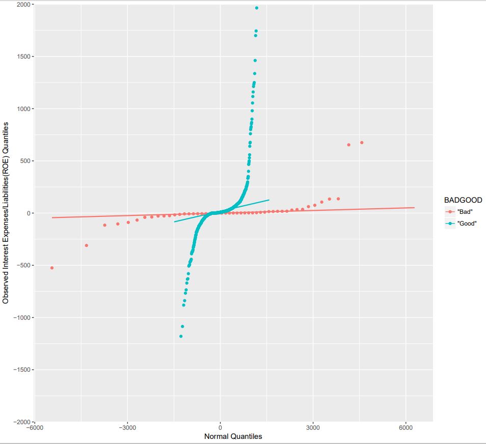
NOTE: The qqplotr package is an extension of the ggplot2 package which offers Q-Q plots of the distribution quantiles of a variable Against those of a Normal distribution – The stat_qq_point() function produces the actual Q-Q plot – The stat_qq_line() function produces the straight line of a Normal-Normal distribution (the reference model) TBD: – Some plots need rescaling after display and this could be done algorithmetically – The plots could be pasted on page using something like the lattice package