
Company Default prediction - DLMM Internal Rating Model in R
- Steps followed to implement the DLMM Model in R language
- Step 1 – Converting SPSS formatted data
- Step 2 - One by one empirical analysis of variables
- Step 3 - Cross-tabulation 01STATUS versus Industry Sector Code
- Step 4 - Exploring graphically the probability distribution of a variable
- Step 5 - Testing the normality of the probability distribution of a variable
- Step 6 - Evaluating the good/bad discriminant power of a variable
- Step 7 - Empirical monotonicity of ROE relative to good-bad progression
- Step 8 - Correlation between variable couples
- Step 9 - Analysis of outliers
- Step 10 - Data encoding
- Step 11 - Synoptic table of variable properties
- Step 12 - Linear Discriminant Analysis - Initial approach
- Step 13 - Experimenting with Stepwise Linear Discriminant Analysis
- Step 14 - Gaussian Copula encoding scheme
Step 4 – Exploring graphically the probability distribution of a variable
It follows the section: 4.5.4 Graphical analysis (page 140 of the DLMM book)
We want to uses Box plots, Q–Q plots graphical displays in order to visualise the outliers of each distribution (Box plot)
and test the normality of each of these distributions distribution (Q-Q plot)
Using the standard plot() function
Although it is always possible to get a quick display of a variable ditrbution using the standard R plot() function such as in the following:
plot(wcs2train$ROE~wcs2train$BADGOOD, xlab=”Status”, ylab=”ROE”, main=”Boxplots of ROE by Status”)
As the range of the variable distribution is hugely, this display is poor it is preferable to use more appropriate functions
Using ggplot() Box plot function for the display of ROE (Ratio Net Profit/Equity)
Far more useful displays are generated using the Box plot ggplot() from the ggplot2 R package
library(ggplot2)
ggplot(wcs2train, aes(x = wcs2train$BADGOOD, y = wcs2train$ROE)) + stat_boxplot(geom =’errorbar’, width=0.1) + geom_boxplot(width=0.2, fill=’#A4A4A4′) + labs(x = “01STATUS”,y = “Netprofit/Equity”) + scale_y_continuous(limits=c(-300,300), breaks=seq(-300,300,100), expand = c(0, 0))
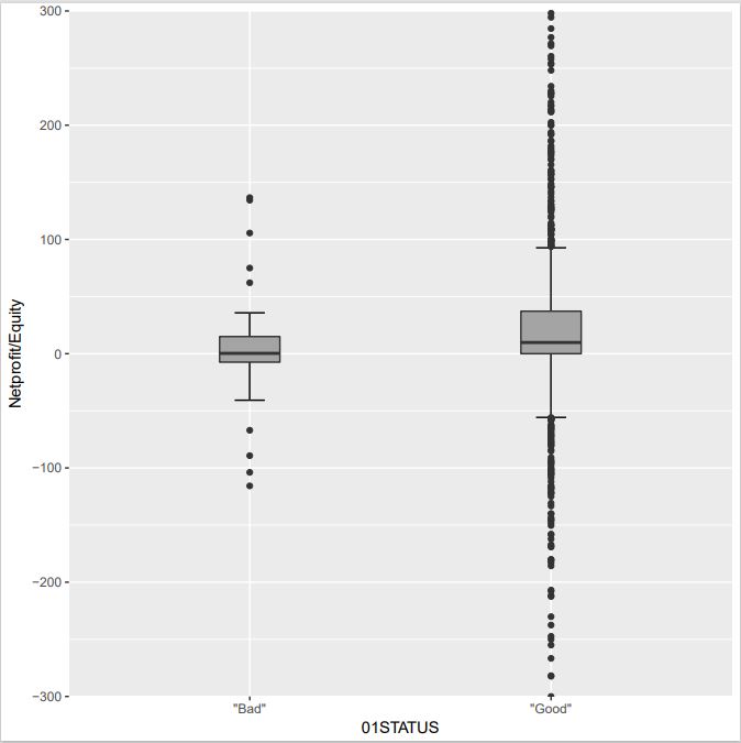
NOTE: Here we have accumulated a few tricks using ggplot in ggplot2 package – stat_boxplot(geom =’errorbar’, width=0.1) give whiskers with a controlled width – labs(x = “01STATUS”,y = “Netprofit/Equity”) controls the legend x/y – geom_boxplot(width=0.2, fill=’#A4A4A4′) slects a gray color for the boxes witha controlled width – scale_y_continuous(limits=c(-300,300), breaks=seq(-300,300,100), expand = c(0, 0)) set the y axis upper and lower values while selecting the break ticks
Although the previous dispaly does separate the outliers from the 2-sigma range, the corresponding companies are not identified
This done in this phase by creating the specific function is_outlier() built using the Rccp R package
library(Rcpp)
library(dplyr)
library(ggplot2)
is_outlier <- function(x) { return(x < quantile(x, 0.25) – 1.5 * IQR(x) | x > quantile(x, 0.75) + 1.5 * IQR(x)) }
wcs2train %>% group_by(BADGOOD) %>% mutate(outlier = ifelse(is_outlier(ROE), BORCODE, as.numeric(NA))) %>% ggplot(., aes(x = BADGOOD, y = ROE)) + stat_boxplot(geom =’errorbar’, width=0.1) + geom_boxplot(width=0.2, fill=’#A4A4A4′) + labs(x = “01STATUS”,y = “Netprofit/Equity”) + scale_y_continuous(limits=c(-300,300), breaks=seq(-300,300,100), expand = c(0, 0)) + geom_text(aes(label = outlier), na.rm = TRUE, hjust = -0.3, check_overlap = T)
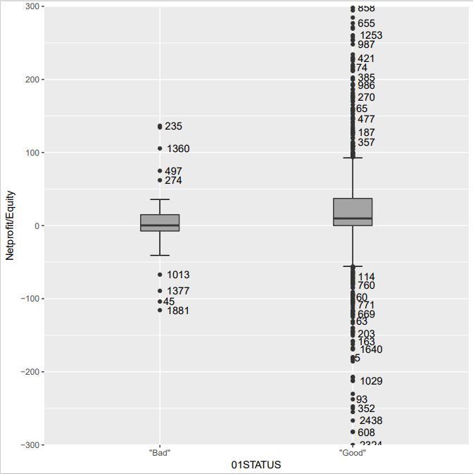
NOTE: The dplyr package (as the magrittr package) use the %>% pipe operator – the use of the mutate() function in order to build an outlier mask for the outliers is probably due to the use of mutate() – the is-outlier() function labels the outliers – geom_text(aes(label = outlier), na.rm = TRUE, hjust = -0.3, check_overlap = T) does the labelling of these points
Although the outliers are labelled in the previous display they still are difficult to identify when they are closely clustered
as they are all plotted on the same side of the axis
In order to ease this individual identification, the use the ggrepel R package
library(ggrepel)
library(dplyr)
library(ggplot2)
wcs2train %>% group_by(BADGOOD) %>% mutate(outlier = ifelse(is_outlier(ROE), BORCODE, as.numeric(NA))) %>% ggplot(., aes(x = BADGOOD, y = ROE)) + geom_boxplot() + scale_y_continuous(limits=c(-300,300), breaks=seq(-300,300,100), expand = c(0, 0)) + geom_text_repel(aes(label = outlier))
wcs2train %>% group_by(BADGOOD) %>% mutate(outlier = ifelse(is_outlier(ROE), BORCODE, as.numeric(NA))) %>% ggplot(., aes(x = BADGOOD, y = ROE)) + stat_boxplot(geom =’errorbar’, width=0.1) + geom_boxplot(width=0.2, fill=’#A4A4A4′) + labs(x = “01STATUS”,y = “Netprofit/Equity”) + scale_y_continuous(limits=c(-300,300), breaks=seq(-300,300,100), expand = c(0, 0)) + geom_text_repel(aes(label = outlier))
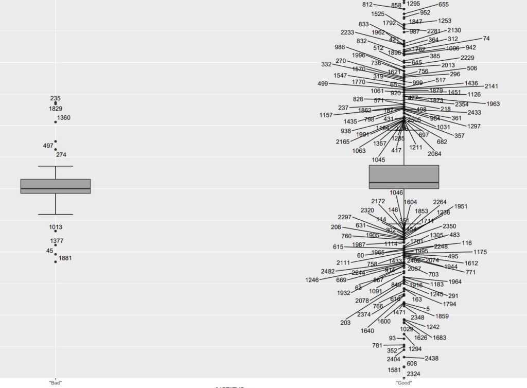
NOTE: The ggrepel package is an extension of dplyr+ggplot2 – geom_text_repel replaces the geom_text function and enables to create pointers to outliers while avoiding the overlapping of labels. Any outlier can thus be identified