
Company Default prediction - DLMM Internal Rating Model in R
- Steps followed to implement the DLMM Model in R language
- Step 1 – Converting SPSS formatted data
- Step 2 - One by one empirical analysis of variables
- Step 3 - Cross-tabulation 01STATUS versus Industry Sector Code
- Step 4 - Exploring graphically the probability distribution of a variable
- Step 5 - Testing the normality of the probability distribution of a variable
- Step 6 - Evaluating the good/bad discriminant power of a variable
- Step 7 - Empirical monotonicity of ROE relative to good-bad progression
- Step 8 - Correlation between variable couples
- Step 9 - Analysis of outliers
- Step 10 - Data encoding
- Step 11 - Synoptic table of variable properties
- Step 12 - Linear Discriminant Analysis - Initial approach
- Step 13 - Experimenting with Stepwise Linear Discriminant Analysis
- Step 14 - Gaussian Copula encoding scheme
Step 10 – Data encoding
Purpose
Here we follow step by step the contents of Chap. 4, section 4.5.9 : Transformation of indicators, pp. 164-177
Method
Replacement of NA encoded outliers by multidimensional interpolation – -> (https://github.com/MoiraCorp/DLMM-IRating-in-R/tree/main/steps/step10/naencode)
Transformation of indicators using a logistic formula: the case of the ROE ratio – -> (https://github.com/MoiraCorp/DLMM-IRating-in-R/tree/main/steps/step10/logencode)
Encoding of empirical non-monotonicity: the case of the ROE ratio – -> (https://github.com/MoiraCorp/DLMM-IRating-in-R/tree/main/steps/step10/nmonotencode)
Re-binning categorical variables: the case of the SECTOR variable – -> (https://github.com/MoiraCorp/DLMM-IRating-in-R/tree/main/steps/step10/catencode)
Binning quantitative variables: the case of liaison between SALES and STATUS (BADGOOD) variables – -> (https://github.com/MoiraCorp/DLMM-IRating-in-R/tree/main/steps/step10/binnencode)
Replacement of NA encoded outliers by multidimensional interpolation
In the previous section (step9), we have detected “extreme outliers” and encoded them as NA (not Available) However, most AI methods require the processing FULL datatables.
In sction 4.5.9.1 Treatment of outliers and shapes of distributions (pp 164-165), the authors propose to “fill in” the masqued outliers with either the mean or the median of each of the Ratio Variable statistical distribution. Although it is common practice, this method is based on a very thin probability theory argument.
The present dataset being essentially “multidimensional” it is better justified to proceed with the replacement of the NA values on the basis of the multidimensional relations existing between the Ratio Variables rather than processing them individually. In our case, all variables being numerical (see list below), we will apply Principal Componant Analysis (PCA) and follow by an “interpolation” of the missong valeus based on the PCA factor space vectors. This is performed using the missMDA R package (-> https://cran.r-project.org/web/packages/missMDA/index.html) following a PCA detremined using the FactoMineR R package (-> https://cran.r-project.org/web/packages/FactoMineR/index.html)
The printed output is:# Checking on variables type in the datatable sapply(wcs2train.ratios.NA, class)
ROE EBITDAON ROI ROA V89A ROS ASSETSTU INVENTOR RECEIVAB V94A V95A PAYABLES COMMERCI IEONEBIT NIEONEBI IEONLIAB IEONFINA. EXTRIC TAXESONG INTANGIB TRADERE. V110A EQUITYON TRADEPA. DEBTEQU CURRENT QUICKRA SALESONV SALESMIN ROAMINUS EBITDAIE EQUILIABL DEBTEQUTR ROET “numeric” “numeric” “numeric” “numeric” “numeric” “numeric” “numeric” “numeric” “numeric” “numeric” “numeric” “numeric” “numeric” “numeric” “numeric” “numeric” “numeric” “numeric” “numeric” “numeric” “numeric” “numeric” “numeric” “numeric” “numeric” “numeric” “numeric” “numeric” “numeric” “numeric” “numeric” “numeric” “numeric” “integer”
# Loading the necessary processing libraries library(FactoMineR) library(missMDA) # Estimate the number of PCA components necessary for a correct interpolation of NAs ncomp <- estim_ncpPCA(wcs2train.ratios.NA) # Perform multidimensional interpolation of NA values using the MissMDA method res.imp <- imputePCA(wcs2train.ratios.NA, ncp = ncomp$ncp) # Extract the NA completed rows wcs2train.ratios.CT <- res.imp$completeObs[1:nrow(wcs2train.ratios.NA),]
Comparison of Ratio Variables range and statistics before and after “outliers” processing
We compare the Ratio Variables range and statistics between the corrected datatable wcs2train.ratios.CT and the uncorrected “original” datatable wcs2train.ratios using the built in summry() function from the standard R package.
summary(wcs2train.ratios.CT) summary(wcs2train.ratios)
NOTE: We are not presenting here the printed ouputs of these two functions as they are being too bulky
From these outputs it is esasy to see that the mean and median of each variable are comparable befaore and after processing but that the Min. and Max; “extreme” values have been somewhat “reined in” by the NA values replacement to the exception of vriaables such as V110A for which no outliers were detected (see previous section)Study of Ratio Variables correlation properties after “outliers” processing
A first approach is to graphically evaluate the multi-dimensional variable correlation chart produced by the chart.Correlation() function belonging to the erformanceAnalytics R package (-> https://cran.r-project.org/web/packages/PerformanceAnalytics/index.html)
library(“PerformanceAnalytics”) chart.Correlation(wcs2train.ratios.CT, histogram=TRUE, pch=19)
Illustrated in: Outlier-Treatment_Page165_AllvariableswithCT_CoorDiag.pdf
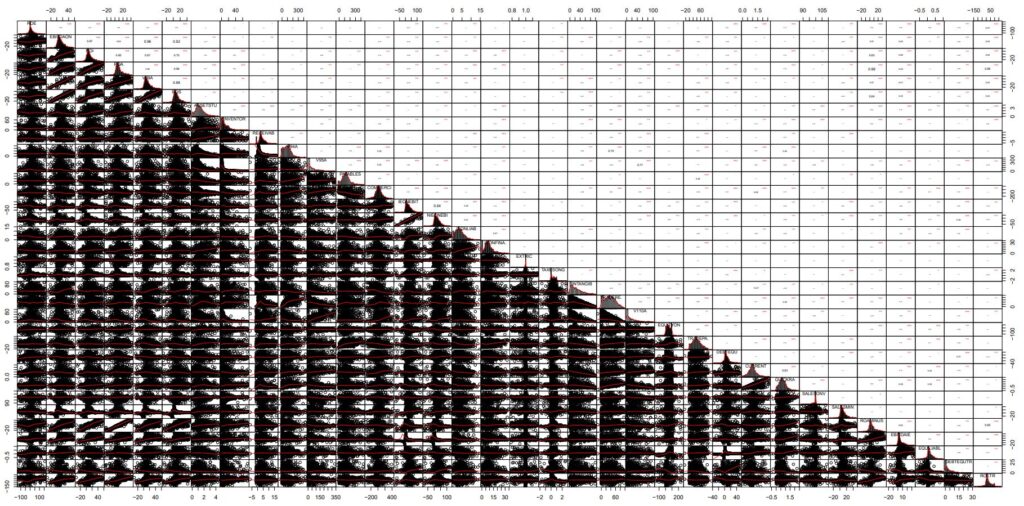
NOTE : In this chart, the cloud points of Corrected data are strikingly similar to those presented in the datatable with outliers masked as NAs (-> https://github.com/MoiraCorp/DLMM-IRating-in-R/tree/main/steps/step9/naoutlr)
A second approach is to compare the pair-wise correlation coefficients between variables as it has been proposed in Step 8 (-> https://github.com/MoiraCorp/DLMM-IRating-in-R/tree/main/steps/step8/allvar).
This process enables to determine potential groups of similar behaved variables. It is done using the corrplot R package (-> https://cran.r-project.org/web/packages/corrplot/vignettes/corrplot-intro.html) uagmented by the corr.pvalue() function (see -> https://github.com/MoiraCorp/DLMM-IRating-in-R/tree/main/steps/step8/selectvar)
cor.pvalue <- function(mat, …) {
mat <- as.matrix(mat)
n <- ncol(mat)
p.mat<- matrix(NA, n, n)
diag(p.mat) <- 0
for (i in 1:(n – 1)) {
for (j in (i + 1):n) {
tmp <- cor.test(mat[, i], mat[, j], …)
p.mat[i, j] <- p.mat[j, i] <- tmp$p.value
}
}
colnames(p.mat) <- rownames(p.mat) <- colnames(mat)
p.mat }
install.packages(“corrplot”)
library(corrplot)
corrprs <- cor(wcs2train.ratios.CT, use=”pairwise”, method=”pearson”)
p.mat <- cor.pvalue(wcs2train.ratios.CT)
col <- colorRampPalette(c(“#BB4444”, “#fcc3b8”, “#FFFFFF”, “#add2f7”, “#4fc69d”))
corrplot(corrprs, method=”color”, col=col(200),
type=”upper”,
addCoef.col = “black”, # Add coefficient of correlation
addCoefasPercent = TRUE,
tl.col=”black”, tl.srt=45, # Text label color and rotation
# Combine with significance p.mat = p.mat, sig.level = 0.01, insig = “blank”,
# hide correlation coefficient on the principal diagonal
diag=FALSE
)
The graphics representation of the Pearson correlation between all the Corrected Ratio Variables is presented in: Outlier-Treatment_Page 165_Ratios_Correlation.pdf
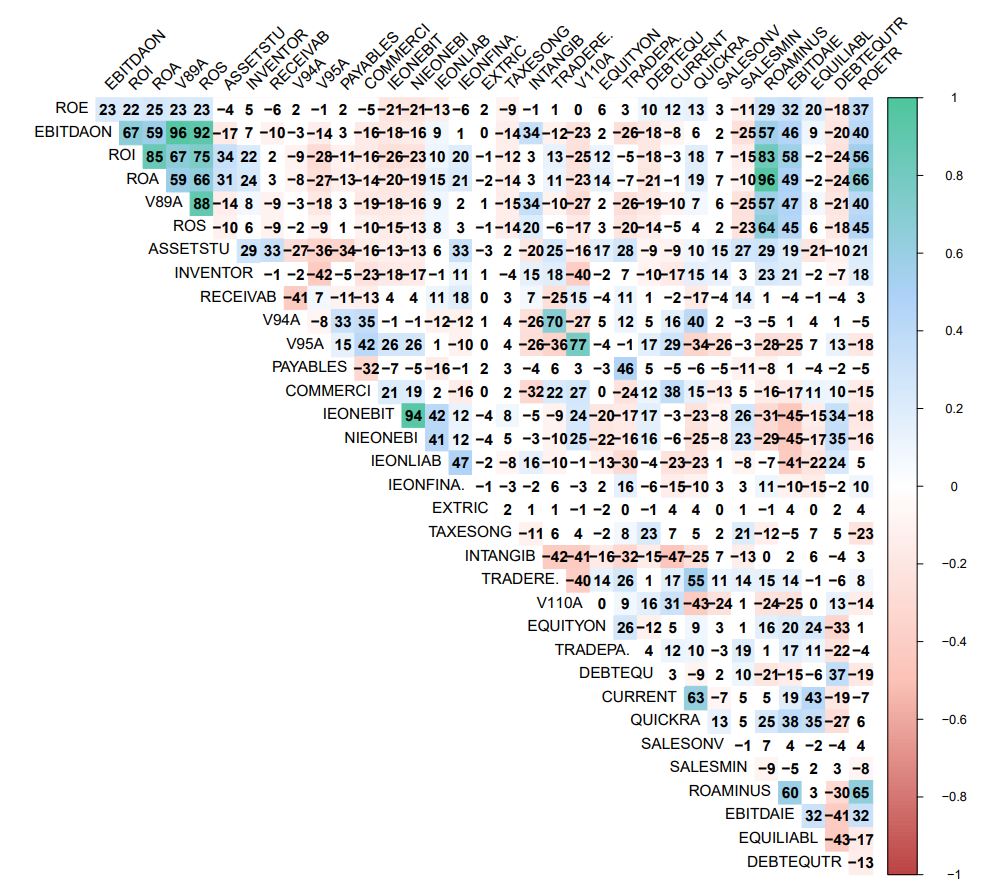
NOTE : It is allmost identical to the correlation diagram established betwwen all Na masqued Ratio Variables (-> https://github.com/MoiraCorp/DLMM-IRating-in-R/tree/main/steps/step8/allvar)
This is conservation of corralation properties is inherent to the MissMCA interpolation method. This type of conservation is NOT guaranteed when using traditional mean-mode interpolation techniques.
A third approach for discovering potential groups of correlated variables is to use PCA. In the present study, the use of Principal Componant Analysis (PCA) is validated by the fact that all variables are numerical. For PCA we are gain using the FactoMineR R package ( -> https://cran.r-project.org/web/packages/FactoMineR/index.html) along with the factoextra R package ( -> https://cran.r-project.org/web/packages/factoextra/readme/README.html) for producing the factor plane displays
install.packages(“factoextra”)
library(factoextra)
library(FactoMineR)
# Perform PCA on NA interpolated matrix
res.pca <- PCA(res.imp$completeObs)
The graphic representation of the PCA results in the 1-2 factor plane is presented in: Outlier-Treatment_Page 165_PCA.pdf
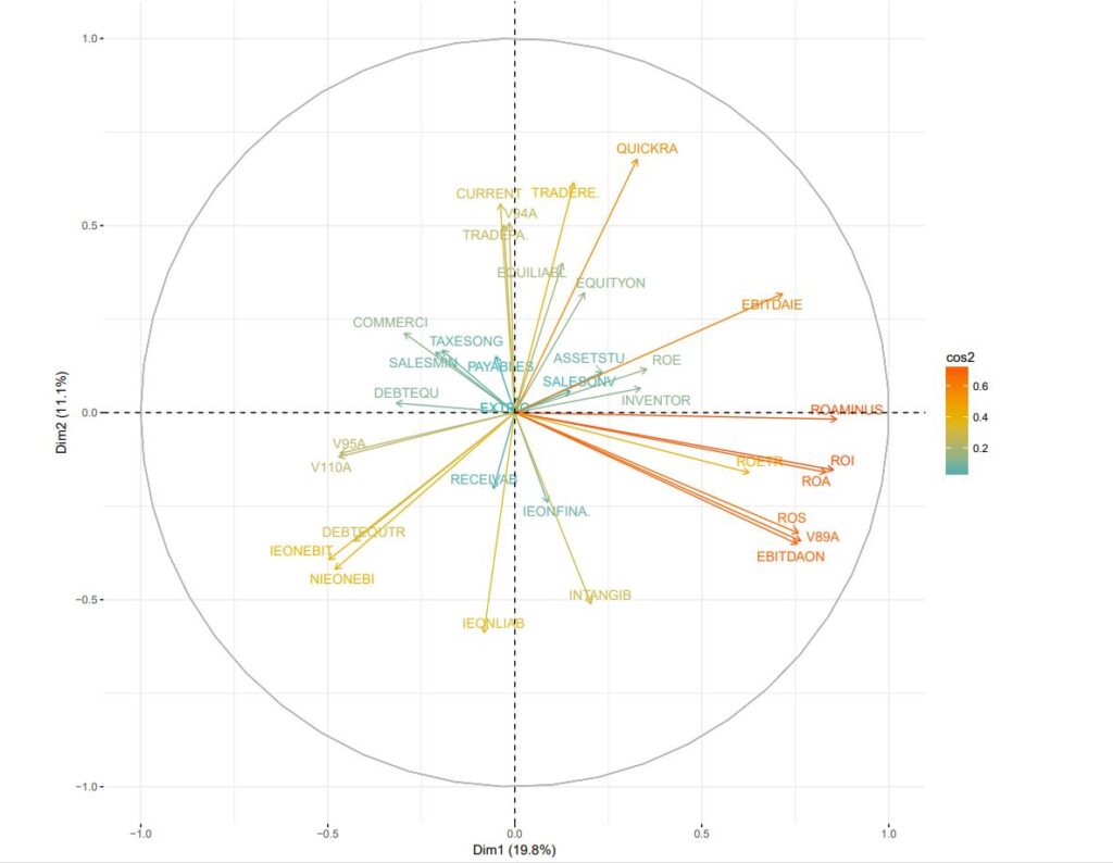
NOTE : This diagram confirms the grouping results outlined above using the Pearson correlation method
Many of the accounting variables as well their Ratios display a form of LogNormal distribution. This is often encountered form in the statistical distribution of “quantities” either in nature or in the social sciences.
The logistic formula offers a way to transform the variables so that their distribution is closer to a Normal distribution. As it applies a Log transform, it is also another way to reduce the influence of “extreme” values (idem, “extreme” outliers)In SPPS, the CDF.LOGISTIC function can be used for the perform a LogNormal to Normal distribution transformation (-> https://www.ibm.com/docs/en/spss-statistics/beta?topic=functions-cumulative-distribution)
In SPPS, the CDF.LOGISTIC function can be used for the perform a LogNormal to Normal distribution transformation (-> https://www.ibm.com/docs/en/spss-statistics/beta?topic=functions-cumulative-distribution)
It is call as: CDF.LOGISTIC(quant, mean, scale) and returns the cumulative probability that a value from the logistic distribution, with the specified mean and scale parameters, will be less than quant.
This corresponds to the mathematical formula: y = 1/(1+e**-(x-a)/b)) with a = mean and b = scale
We have programmed this function in R as CDFlogistic()
CDFlogistic <- function(x,a,b){
power <- (x-a)/b
transform <- 1 / (1 + exp(-power))
return(transform)
}
We follow by performing the logistic transformation recommanded by the authors (pp 170).
However, in order to get an histogram similar to that of presented on page 169, the recommanded slope of 1500 in the book needs to be divided by 10 in our case.
logit <- CDFlogistic(wcs2train$ROE,0,150)
hist(logit, breaks = 50)
LOGIT_ROE <- data.frame(logit)
It is followed by the necessary R calls in order to produce a comparative display of the ROE distribution before and after logistic transformation
Apart from the ggplot2 package, we use the ggplotr R display package (an extension to ggplot2) (-> https://cran.r-project.org/web/packages/qqplotr/index.html and https://cran.r-project.org/web/packages/qqplotr/vignettes/introduction.html) as well as the gridExtra R package for extar grid graphics capability (-> https://cran.r-project.org/web/packages/gridExtra/index.html )
library(ggplot2)
install.packages(“qqplotr”)
library(“qqplotr”)
install.packages(“gridExtra”)
library(“gridExtra”)
p1 <- ggplot(data=wcs2train, mapping = aes(sample=ROE)) + stat_qq_line (color=”grey”) + stat_qq_point(color=”light blue”) + labs(x = “Normal Quantiles”, y = “Observed Interest Expenses/Liabilities(ROE) Quantiles”)
p1 <- p1 + scale_y_continuous(limits=c(-2000,2000), breaks=seq(-2000,2000,500), expand = c(0, 0))
p2 <- ggplot(data=LOGIT_ROE, mapping = aes(sample=logit)) + stat_qq_line (color=”grey”) + stat_qq_point(color=”orange”) + labs(x = “Normal Quantiles”, y = “Logit transformed (ROE) Quantiles”)
p2 <- p2 + scale_y_continuous(limits=c(0,1), breaks=seq(0,1,0.25), expand = c(0, 0))
p3 <- qplot(ROE, data=wcs2train, fill=I(“light blue”), col=I(“black”)) + ggtitle(“Interest Expenses/Liabilities (ROE)”)
p4 <- qplot(logit, data=LOGIT_ROE, fill=I(“orange”), col=I(“black”)) + ggtitle(“Logit transformed (ROE)”)
grid.arrange(p3, p4, p1, p2, nrow = 2)
Illustrated in: Fig_4_19_Page 170_Logit Transformation_ROE uncorrected.pdf
NOTE : The transformation does not remove the outliers which are still present in anomalous tails
Results are spectacularly better in terms of fitting to a normal distribution when the data is transformed so that the outliers have been masked following the method suggested in Step9 – Analysis of outliers – Masking outlier’s values using the NA R notation.
In this case, he slope of 1500 suggested by the authors is beeing used.
library(ggplot2)
library(“qqplotr”)
library(“gridExtra”)
# For use of ggplot2, matrix needed to be turned into a data.frame
wcs2train_CT <- as.data.frame(wcs2train.ratios.CT)
logit <- CDFlogistic(wcs2train_CT$ROE,0,1500)
hist(logit, breaks = 50)
LOGIT_ROE <- data.frame(logit)
p2 <- ggplot(data=LOGIT_ROE, mapping = aes(sample=logit)) + stat_qq_line (color=”grey”) + stat_qq_point(color=”orange”) + labs(x = “Normal Quantiles”, y = “Logit transformed (ROE-Outliers Corrected) Quantiles”)
p2 <- p2 + scale_y_continuous(limits=c(0.40,0.60), breaks=seq(0.40,0.60,0.1), expand = c(0, 0))
p4 <- qplot(logit, data=LOGIT_ROE, fill=I(“orange”), col=I(“black”)) + ggtitle(“Logit transformed (ROE-Outliers Corrected)”)
p1 <- ggplot(data=wcs2train_CT, mapping = aes(sample=ROE)) + stat_qq_line (color=”grey”) + stat_qq_point(color=”light blue”) + labs(x = “Normal Quantiles”, y = “ROE-Outliers Corrected”)
p1 <- p1 + scale_y_continuous(limits=c(-200,200), breaks=seq(-200,200,50), expand = c(0, 0))
p3 <- qplot(ROE, data=wcs2train_CT, fill=I(“light blue”), col=I(“black”)) + ggtitle(“ROE-Outliers Corrected”)
grid.arrange(p3, p4, p1, p2, nrow = 2)
Illustrated in: Fig_4_19_Page 170_Logit Transformation_ROE-CT.pdf
In this section, the authors suggest an “experimental” computation of the probabilty of default contionned to intervals of values of a particular using the isopopulation bin.var() binning function described in Step 7 – Empirical monotonicity of ROE relative to good-bad progression – Comparison between BADGOOD distribution and a binned ROE. The isopopulation intervals are named “indicator” intervals by the authors.
NOTE: Binning is a well known technique. J-P Benzécri has offered a general theoretical background for these techniques, naming them as “probablity transition transform”. They offer ways of Transforming (transitionning) one probability distribution into another. A somewhat simplified version of this concept is found in Markov transition probablity matrices. For example, in image processing, binning is used for contrast enhancement. In other occasions the binning is used in order to transform any distribution into a Normal distribution.
The authors make a point at the interpolation (idem, smoothing) of the probability of each Ratio Variable. They are proposing to use a Logit Transformation for this purpose BUT no pratical example is provided at this stage.
They also points out that there exist a fair amount of subjectivity in the determination of the number of intervals in the binning encoding. Even more so if the intervals are “manually tweaked” in order to enforce the monotonocity.
In the datatable used in the book, there is only one category variable (idem., qualitative), which is SECTOR, the encoding of the sector of activity. Unfortunately, for some companies’ sector, the table is fairly sparse. In order to manipulate a better “balanced” distribution, SECTOR categories need to be regrouped.
For aggregating sectors, the best could be probably to generate a form of similarity abalysis based on the Ratios Variables corrected from extreme outliers. For this purpose we are evaluating the Analysis of Similarities ANOSIM method (https://www.rdocumentation.org/packages/vegan/versions/2.3-5/topics/anosim)
install.packages(“vegan”)
library(vegan)
sector.ano <- anosim(wcs2train_CT,wcs2train$SECTOR)
plot(sector.ano)
NOTE: Due to computation time, it is probably more efficient to work with a limited number of principal components extracted from a prior PCA of the Ratio Variables datatable
The results are illustrated in: Table_4_22b_page 172_SECTOR Group similiraties.pdf
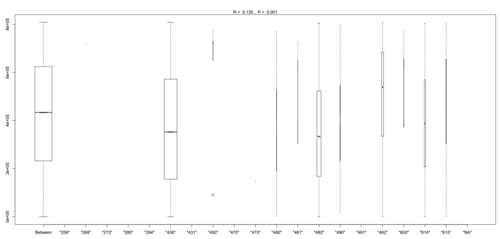
From the illustration, one can suggest the following regrouping: SC1: 482 SC2: 430 SC3: 614, 490, 480 SC4: 492, 481, 600, 615, (450) SC5: All others These results are similar to those proposed empirically by the authors on page 172
Testing the discrimatory power of regrouped sectors
The printed output is:table(wcs2train$SECTOR, wcs2train$BADGOOD) sector_recoded <- subset(wcs2train, select=c(“SECTOR”)) sector_recoded$SECTOR3 <- revalue(sector_recoded$SECTOR, c( ‘”482″‘=’SC1’, ‘”430″‘=’SC2’, ‘”614″‘=’SC3’,'”490″‘=’SC3’,'”480″‘=’SC3’, ‘”492″‘=’SC4’,'”481″‘=’SC4’,'”600″‘=’SC4’,'”615″‘=’SC4’,'”450″‘=’SC4’, ‘”258″‘=’SC5’,'”268″‘=’SC5’,'”273″‘=’SC5’,'”280″‘=’SC5’,'”294″‘=’SC5’,'”431″‘=’SC5’,'”470″‘=’SC5’,'”473″‘=’SC5’,'”491″‘=’SC5’,'”NA”‘=’SC5’)) table(sector_recoded$SECTOR3, wcs2train$BADGOOD)
| Group code | “Bad” | “Good” |
|---|---|---|
| SC5 | 0 | 12 |
| SC2 | 33 | 712 |
| SC4 | 5 | 160 |
| SC3 | 6 | 101 |
| SC1 | 7 | 236 |
The printed output is:tbl <- table(sector_recoded$SECTOR3, wcs2train$BADGOOD) chisq.test(tbl)
data: tbl X-squared = 2.7683, df = 4, p-value = 0.5973
It is good to list here the results which were previously obtained with the oricinal SECTOR categories as:
The printed output is:data: tbl X-squared = 4.2799, df = 18, p-value = 0.9996
It is interesting to note that for the recoded SECTOR3 variable, the p value is about 0.6 which is better than almost 1.0 for the initial SECTOR variable. However, the value of 0.6 is still well above the 0.05 significance level which would guarantee that SECTOR3 is significantly influenced by the fat that the companies are in default.
Binning quantitative variables: the case of liaison between SALES and STATUS (BADGOOD) variables
A ROC analysis of the relation between SALES and Good-Bad status gives poor results similar to those obtained with ROE, the author has a similar opinion on page 173.
The printed output is:library(pROC) sales <- wcs2train$SALES rocs = roc(wcs2train$BADGOOD, sales) auc1 <- auc(rocs)
Area under the curve: 0.5977
The printed output is:roc1 = roc(wcs2train$BADGOOD, wcs2train$ROE) # Printing the ROC asymptotic intervals ci1 <- ci(rocs)
95% CI: 0.5213-0.674 (DeLong)
The printed output is:# Getting the Std. Error under a non parametric assumption vr1 <- var(rocs)^0.5
[1] 0.0389407
The authors propose to “bin” the variable SALES into a small number of classes in order to have a better contrast between firm’s categories. We will compare the results obtained from an “isopupulation” binning method similar to the one already used in order to study the monotonicity of the Ratio Variables with the manual method adopetd by the authors for determining the intervals of binning.
Isopopulation «binning» of Log10-SALES in order to explore concordances of SALES level with default rate – -> (https://github.com/MoiraCorp/DLMM-IRating-in-R/tree/main/steps/step10/binnencode/isoencode)
Using empirical « binning » proposed by authors on SALES in order to explore concordances of SALES level with default rate – -> (https://github.com/MoiraCorp/DLMM-IRating-in-R/tree/main/steps/step10/binnencode/manencode)
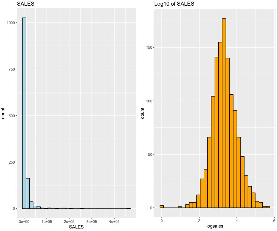
Isopopulation «binning» of Log10-SALES in order to explore concordances of SALES level with default rate
Here we use an “isopupulation” binning method similar to the one already used in order to study the monotonicity of the Ratio Variables, a technique already used in with function bin.var() section Step7-Binning (–> https://github.com/MoiraCorp/DLMM-IRating-in-R/tree/main/steps/step7/binning). However, due to the strong LogNormal nature of the SALES probability distribution we will prefer to work with the Log10 of SALES rather than with the original values.
logsales <- log10(wcs2train$SALES)
# Cleaning: turning infinite values into NA
logsales[is.infinite(logsales)] = NA
LOGSALES <- data.frame(logsales)
library(ggplot2)
library(“qqplotr”)
library(“gridExtra”)
p1 <- qplot(SALES, data=wcs2train, fill=I(“light blue”), col=I(“black”)) + ggtitle(“SALES”)
p2 <- qplot(logsales, data=LOGSALES, fill=I(“orange”), col=I(“black”)) + ggtitle(“Log10 of SALES”)
grid.arrange(p1, p2, nrow = 1)
The result is illustrated in: Fig_4_21b_Page 174_SALES_Log10.pdf
In order to match the intervals proposed by the author we decides to section into 5 equipopulation “bins” which are determined using the quantile() function from the satndard R package.
The printed output is:bins_cut = 5 quant <- quantile(logsales, probs = seq(0, 1, 1/bins_cut), na.rm = TRUE) quant
Percent 0% 20% 40% 60% 80% 100% Boundary 1.000 658.000 1403.195 2829.598 7591.993 464186.000
NOTE: It is worth noting here that Log10-SALES vector has been previously “cleaned” the eliminating the minus-infinity values and replacing them by NA. Thus in SALES the firms with zero values have been discarded. This explains that here the minimum value is 1.
The printed output is:# Encoding Log10-SALES as a factor bins_cut = 5 for(j in 1:bins_cut) { if(j == 1){ collist <- c(sprintf(“%s_1″,”SALES”)) } else { collist <- append(collist, sprintf(“%s_%s”,”SALES”,j)) } } SALES5 <- with(LOGSALES, bin.var(LOGSALES$logsales, bins=bins_cut, method=’proportions’, labels=collist)) table(SALES5, wcs2train$BADGOOD)
| SALES5 | “Bad” | “Good” |
|---|---|---|
| SALES_1 | 6 | 248 |
| SALES_2 | 9 | 242 |
| SALES_3 | 9 | 243 |
| SALES_4 | 11 | 241 |
| SALES_5 | 16 | 237 |
The printed output is:tbl <- table(SALES5, wcs2train$BADGOOD) chisq.test(tbl)
Pearson’s Chi-squared test data: tbl X-squared = 5.5925, df = 4, p-value = 0.2317
NOTE : Although the result of the Chi-square test is much better than previous one (ex: 0.23 compared with 0.59 for recoded SECTOR (SECTOR3)), it is not yet conclusive as the level of positive test on concordance is at 0.05
Using empirical « binning » proposed by authors on SALES in order to explore concordances of SALES level with default rate
The printed output is:bookquant[2] = 1000 bookquant[3] = 7500 bookquant
   0% 33.33333% 66.66667%      100%
    0      1000      7500    464186
The printed output is:# Encoding SALES as a factor bins_cut = 3 for(j in 1:bins_cut) { if(j == 1){ collist <- c(sprintf(“%s_1″,”SALES”)) } else { collist <- append(collist, sprintf(“%s_%s”,”SALES”,j)) } } SALES3 <- with(wcs2train, cut(wcs2train$SALES, bookquant, include.lowest = TRUE, labels=collist)) tbl <- table(SALES3, wcs2train$BADGOOD) tbl
| SALES5 | “Bad” | “Good” |
|---|---|---|
| SALES_1 | 9 | 380 |
| SALES_2 | 26 | 601 |
| SALES_3 | 16 | 240 |
The printed output is:tbl <- table(SALES3, wcs2train$BADGOOD) chisq.test(tbl)
Pearson’s Chi-squared test data: tbl X-squared = 6.2766, df = 2, p-value = 0.04336
NOTE: The “empirical” binning of the SALES variable proposed by the authors, does display a strong concordance (p < 0.05) between SALES level and default rate. However the proposed arguments for selecting the “binning” (idem, coding) intervals does not lead to a systematic “binning” methodology.