Company Default prediction - DLMM Internal Rating Model in R
- Steps followed to implement the DLMM Model in R language
- Step 1 – Converting SPSS formatted data
- Step 2 - One by one empirical analysis of variables
- Step 3 - Cross-tabulation 01STATUS versus Industry Sector Code
- Step 4 - Exploring graphically the probability distribution of a variable
- Step 5 - Testing the normality of the probability distribution of a variable
- Step 6 - Evaluating the good/bad discriminant power of a variable
- Step 7 - Empirical monotonicity of ROE relative to good-bad progression
- Step 8 - Correlation between variable couples
- Step 9 - Analysis of outliers
- Step 10 - Data encoding
- Step 11 - Synoptic table of variable properties
- Step 12 - Linear Discriminant Analysis - Initial approach
- Step 13 - Experimenting with Stepwise Linear Discriminant Analysis
- Step 14 - Gaussian Copula encoding scheme
Step 6 – Evaluating the good/bad discriminant power of a variable
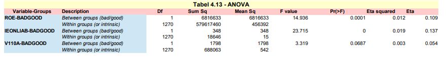
ANOVA of variable-BADGOOD assocation – -> (https://github.com/MoiraCorp/DLMM-IRating-in-R/tree/main/steps/step6/anova)
Chi-square (Pearson) test of association between two categorical variables SECTOR-BADGOOD – -> (https://github.com/MoiraCorp/DLMM-IRating-in-R/tree/main/steps/step6/chisquare)
Chi-square Phi and Cramer’s V measures – -> (https://github.com/MoiraCorp/DLMM-IRating-in-R/tree/main/steps/step6/phicramer)
ROC curves and Area under ROC (AuROC) – -> (https://github.com/MoiraCorp/DLMM-IRating-in-R/tree/main/steps/step6/roc)
wcs2train.lmROE = lm(ROE ~ BADGOOD, data = wcs2train)
summary(wcs2train.lmROE)
anvROE <- anova(wcs2train.lmROE)
write.csv(anvROE, file = “C:/Projets_En_Cours/AI_MTPL/UCI_Internal_Ratings/R Notes/anvROE.csv”)
This code is repeated for variables IEONLAB and V110A saving the results in tables: anvIEONLIAB.csv and anvV110A.csv
The results for the 3 variables ROE, IEONLAB and V110A are collated in one table in Table_4_13_ANOVA.xls
in order to match the presentation in the DLMM book on page 150
Eta-squared is the sample proportion of variance explained in a numerical variable by a categorical predictor variable. Eta2 is computed as between-groups sum of squares divided by total sum of squares. Eta is the square root of Eta.
It is computed from inside the file Table_4_13_ANOVA.xls
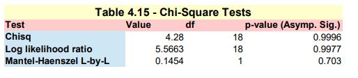
Chi-square (Pearson) test of association between two categorical variables SECTOR-BADGOOD
Here we are mirroring the SPSS Chi-Square Independence Test -> https://www.spss-tutorials.com/spss-chi-square-independence-test/ in order to mimic the results illustrated in Table 4.15 – Chi-square test presented in the DLMM book on page 151 In order to do so, we need to perform the following tasks :
- Pearson Chi-Square test
- Likelihodd Ratio test
- Linear-by-Linear Association
NOTE: in the IBM’s support page for SPSS, it is stated in a technote on the Chi² test: ‘The Crosstabs procedure includes the Mantel-Haenszel test of trend among its chi-square test statistics. … The MH test for trend will be printed in the “Chi-Square Tests” table and labelled “Linear-by-Linear Association”.’
Pearson Chi-Square test
Here we use the chisq.test() function from the standard R installation
The printed output is:tbl <- table(wcs2train$SECTOR, wcs2train$BADGOOD) chisq.test(tbl)
Pearson’s Chi-squared test data: tbl X-squared = 4.2799, df = 18, p-value = 0.9996
Likelihood Ratio test
Here we use the likelihood.test() function from the R Deducer package -> https://www.rdocumentation.org/packages/Deducer/versions/0.7-9/topics/likelihood.test
The printed output is:install.packages(“Deducer”) library(Deducer) likelihood.test(tbl)
Log likelihood ratio (G-test) test of independence without correction data: tbl Log likelihood ratio statistic (G) = 5.5663, X-squared df = 18, p-value = 0.997
Linear-by-Linear Association
Here we use the mantel.test() function from the R lazyWeave package -> https://www.rdocumentation.org/packages/lazyWeave/versions/3.0.2/topics/mantel.test The mantel.test() function performs a Mantel-Haenszel test for linear trend in two way tables
The printed output is:install.packages(“lazyWeave”) library(lazyWeave) mantel.test(wcs2train$SECTOR, wcs2train$BADGOOD)
Mantel Haenszel Chi-Square Test for Two Way Tables data: M^2 = 0.1454, df = 1, p-value = 0.703 NOTE: It is worth noting that the result is slightly different from that of the one presented on page 151 of the DLMM book
The 3 test results are collated in Table_4_15_Page 151_Chi_Square_Tests.xls and presented in Table_4_15_Page 151_Chi_Square_Tests.pdf
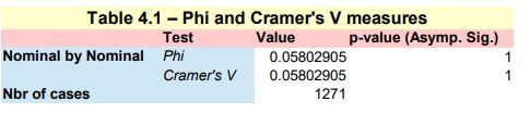
Phi and Cramer’s V measures
This implementation follows step by step the content of Chap. 4, section 4.5.5 : Discriminant power, pp. 152
Here we use the Phi() and CramerV() functions from the R DescTools package -> https://cran.r-project.org/web/packages/DescTools/index.html
install.packages(“DescTools”) library(DescTools) tbl <- table(wcs2train$SECTOR, wcs2train$BADGOOD)
Phi measure of association
Phi(tbl)
The printed output is:
[1] 0.05802905
Cramer measure of association
CramerV(tbl)
The printed output is:
[1] 0.05802905
The 2 results are collated in Table_4_16_Page 152_Phi_CramerV.xls and presented in Table_4_16_Page 152_Phi_CramerV.pdf
ROC curves and Area under ROC (AuROC)
A ROC crurve (Receiver Operating Characteristic) tells how the sensitivity and specificity will trade off, if one uses different thresholds to convert the predicted probability into a predicted classification. Since the predicted probability will be a function of the test result variable, it is also telling how they trade off if one use different test result values as a threshold.
This implementation follows step by step the content of Chap. 4, section 4.5.5 : Discriminant power, pp. 152
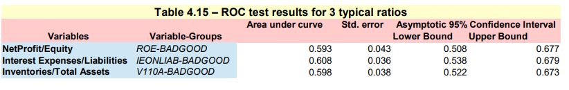
ROC numerical summaries
Here we use the auc(), ci() and var() functions from the R pROC package -> https://cran.r-project.org/web/packages/pROC/index.html
install.packages(“pROC”) library(pROC) roc1 = roc(wcs2train$BADGOOD, wcs2train$ROE)
Printing the AuROC (Area under ROC curve)
The printed output is:auc1 <- auc(roc1)
Area under the curve: 0.5927
Printing the ROC asymptotic intervals
The printed output is:ci1 <- ci(roc1)
95% CI: 0.5085-0.6769 (DeLong)
Getting the Std. Error under a non parametric assumption
The printed output is:vr1 <- var(roc1)^0.5
[1] 0.0429671
The results obtained for the 3 variables: ROE,IEONLIAB and V110A, namely R tables: roc1,roc2 and roc3
roc1 = roc(wcs2train$BADGOOD, wcs2train$ROE) roc2 = roc(wcs2train$BADGOOD, wcs2train$IEONLIAB) roc3 = roc(wcs2train$BADGOOD, wcs2train$V110A)
followed by:
roc1_result <- c(auc1[1], vr1, ci1[1], ci1[3]) roc2_result <- c(auc2[1], vr2, ci2[1], ci2[3]) roc3_result <- c(auc3[1], vr3, ci3[1], ci3[3])
are collated in table ROCS3.csv and presented in Fig_4_15_Page 155-156_ROC Tests.pdf
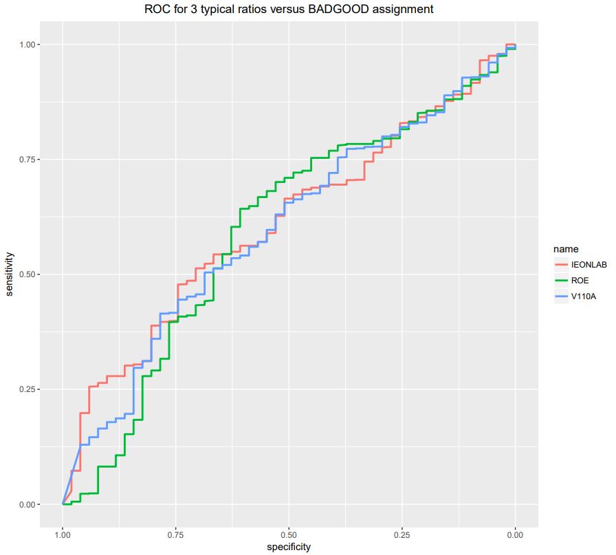
Here we use the ggroc() function from the pROC package -> https://cran.r-project.org/web/packages/pROC/index.html
ggroc(list(ROE=roc1, IEONLAB=roc2, V110A=roc3), size=1) + ggtitle(“ROC for 3 typical ratios versus BADGOOD assignment”) + theme(plot.title = element_text(hjust = 0.5))
The resulting curves are presented in Fig_4_15_Page 155-156_ROC Curves.pdf
We are build a similar ROS results table (ex; ROOCS3) for all the whole set of ratio variables from ROE to ROETR
The position of these starting and ending ratios inside the wcs2train dataframe are respectively :
ROE at wcs2train[86] and ROETR at wcs2train[119]
We are scanning all the columns of wcs2train table from index 86 to index 119 and compute their RCS test results which are placed in table ROCSF which is saved in the file ROCSF.csv
varcount = 0
for(i in 86:119){
rocr = roc(wcs2train$BADGOOD, wcs2train[,i])
aucr <- auc(rocr)
cir <- ci(rocr)
vrr <- var(rocr)^0.5
rocr_result <- c(aucr[1], vrr, cir[1], cir[3])
varcount = varcount + 1
if (varcount == 1){
ROCSR <- data.frame(rocr_result)
names(ROCSR)[varcount] <- colnames(wcs2train)[i]
} else {
ROCSR <- cbind(ROCSR, data.frame(rocr_result))
names(ROCSR)[varcount] <- colnames(wcs2train)[i]
}
}
rownames(ROCSR) <- c(“Area”, “Std. Error”, “Lower Bound”, “Upper Bound”)ROCSF <- t(ROCSR)
write.csv(ROCSF, file = “C:/Projets_En_Cours/AI_MTPL/UCI_Internal_Ratings/R Notes/ROCSF.csv”)
The table of ROC test results for all ratios is presented in : ROC_All ratios_v_BADGOOD_Page 157.pdf
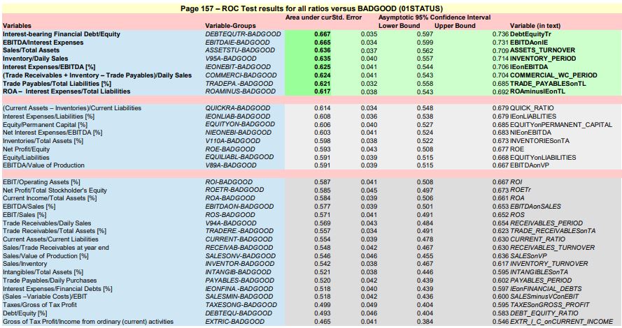
Following the recommandations of the author, the ratios with best separation (AuROC >= 0.62) are:
- DEBTEQUTR Interest-bearing Financial Debt/Equity
- EBITDAIE EBITDA/Interest Expenses
- ASSETSTU Sales/Total Assets
- V95A Inventory/Daily Sales
- IEONEBIT Interest Expenses/EBITDA [%]
- COMMERCI (Trade Receivables + Inventory – Trade Payables)/Daily Sales
- TRADEPA. Trade Payables/Total Liabilities [%]
- ROAMINUS ROA – Interest Expenses/Total Liabilities
NOTE : None of the 3 variables studied so far : ROE, IEONLIAB and V110A are is this « best » pack !
Also, DEBTEQUTR is a combined variable added “on purpose (ad-hoc ?) by the author at the end of the table
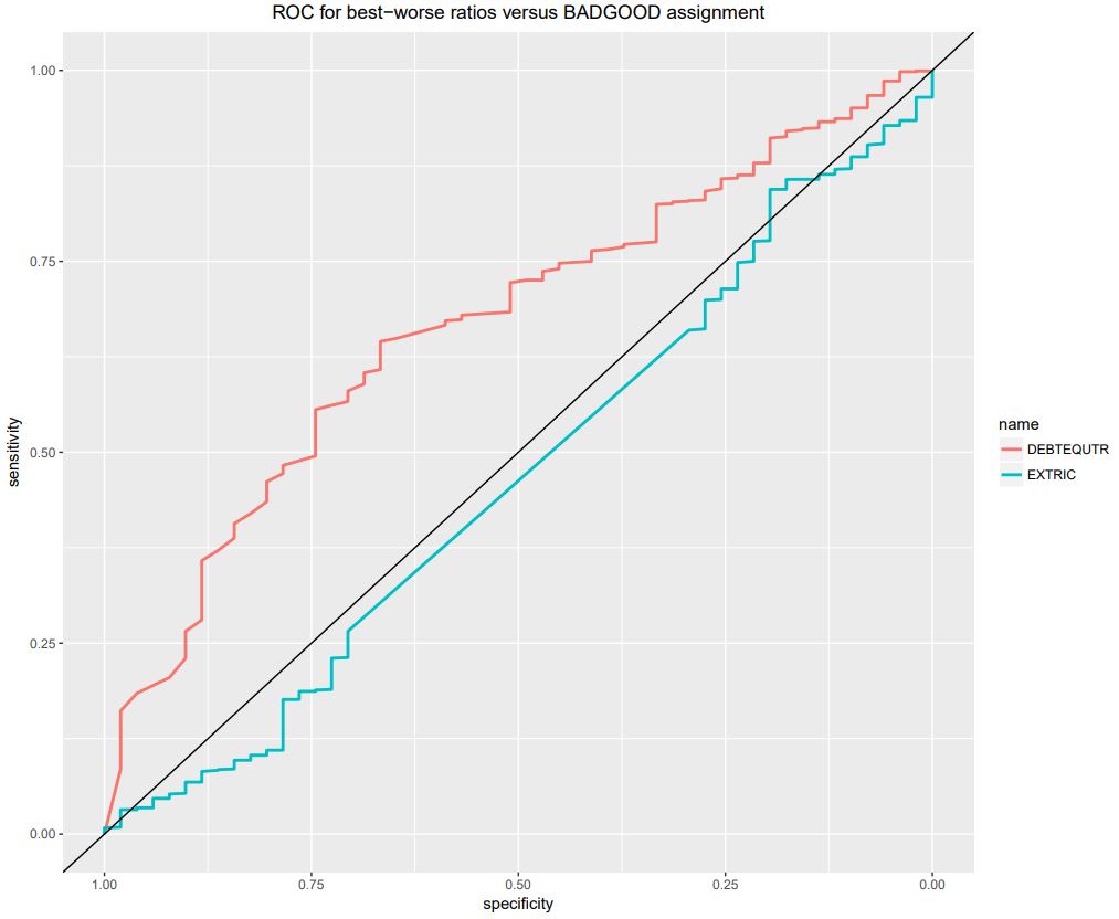
We are also presenting on the same graph, the ROC curves for :
- the best BAD-GOOD separator ratio, DEBTEQUTR with an AuROC = 0.667
- the worst BAD-GOOD separator ratio, EXTRIC with an AuROC = 0.465, which is below the 50%-50% separation (AuROC = 0.5)
roc1 = roc(wcs2train$BADGOOD, wcs2train$DEBTEQUTR)
roc2 = roc(wcs2train$BADGOOD, wcs2train$EXTRIC)
ggroc(list(DEBTEQUTR=roc1, EXTRIC=roc2), size=1) + ggtitle(“ROC for best-worse ratios versus BADGOOD assignment”) + theme(plot.title = element_text(hjust = 0.5)) + geom_abline(intercept=1, slope=1)
NOTE : The geom_abline() function from th ggplot2 package traces the 0.5 AuROC curve which represents the H0 (zero) hypothetis or 50%-50% separation
The illustration is saved in: ROC_Best-Worst ratios_v_BADGOOD_Page 157.pdf